
Some book cover designs for my favorite streaming shows ~
At a glimpse
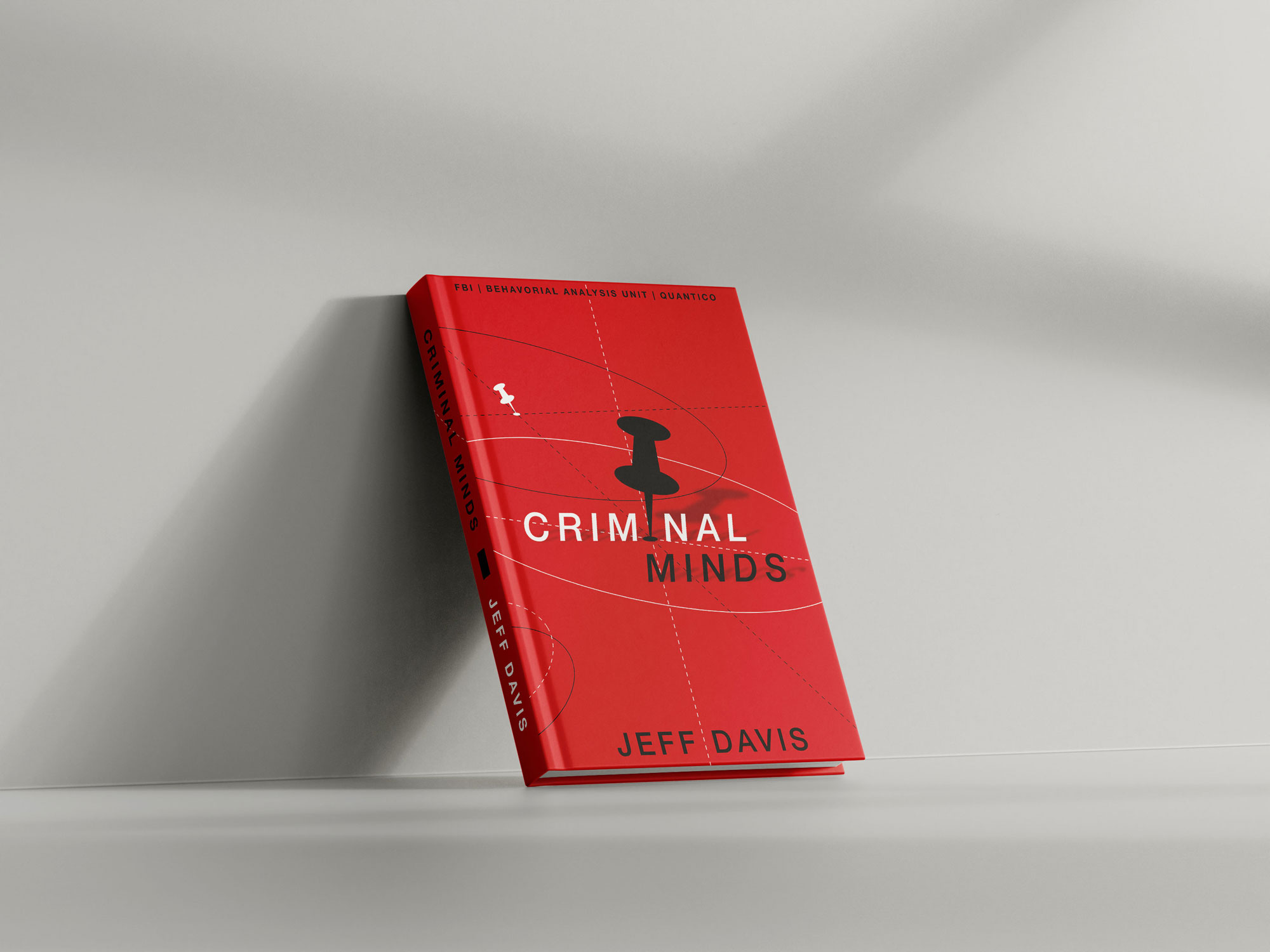
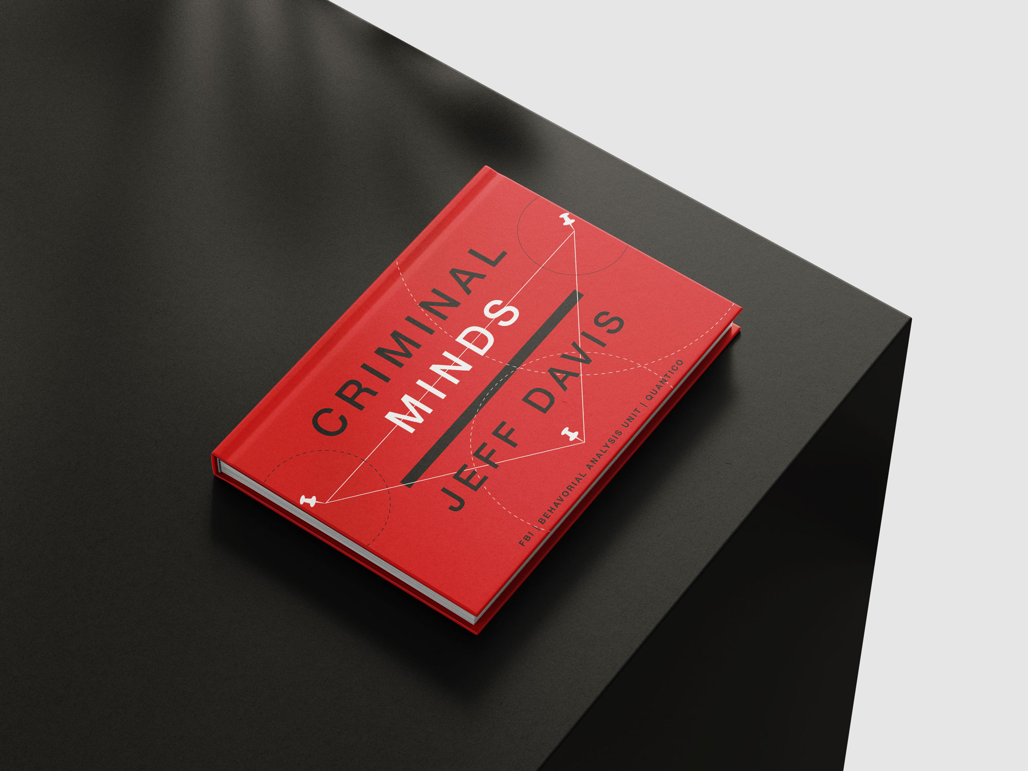
Criminal Minds
Brand Analysis
Click to enlarge
Design Process
KEEP:
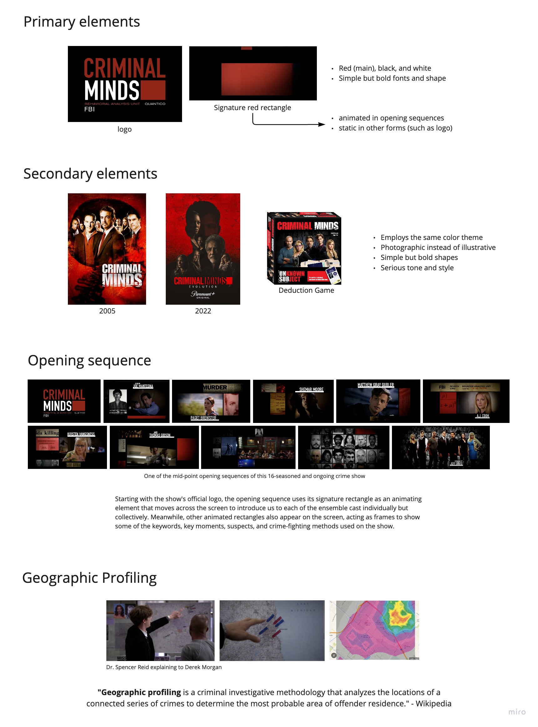
I liked the show's simple but bold approach, especially the use of shapes.
The red-black color scheme is such a CLASSIC. Keep!
THROW AWAY:
The show's branding approach almost always shows a hierarchical collage composition of the BAU (Behavorial Analysis Unit, FBI) team posing crossed-arms, this makes the tone serious and intimidating. I want to show that it can also be fun, exciting, and even educating.
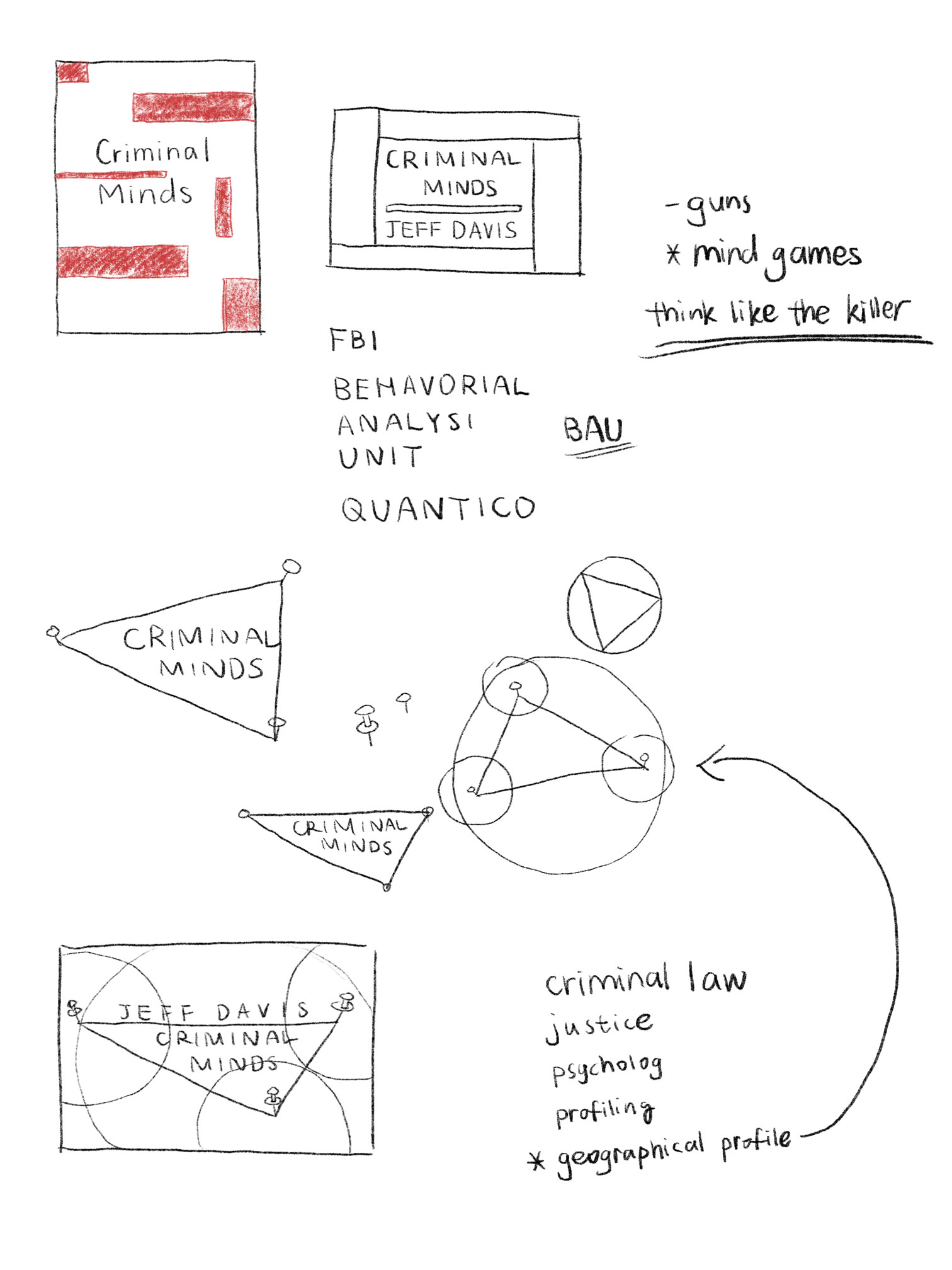
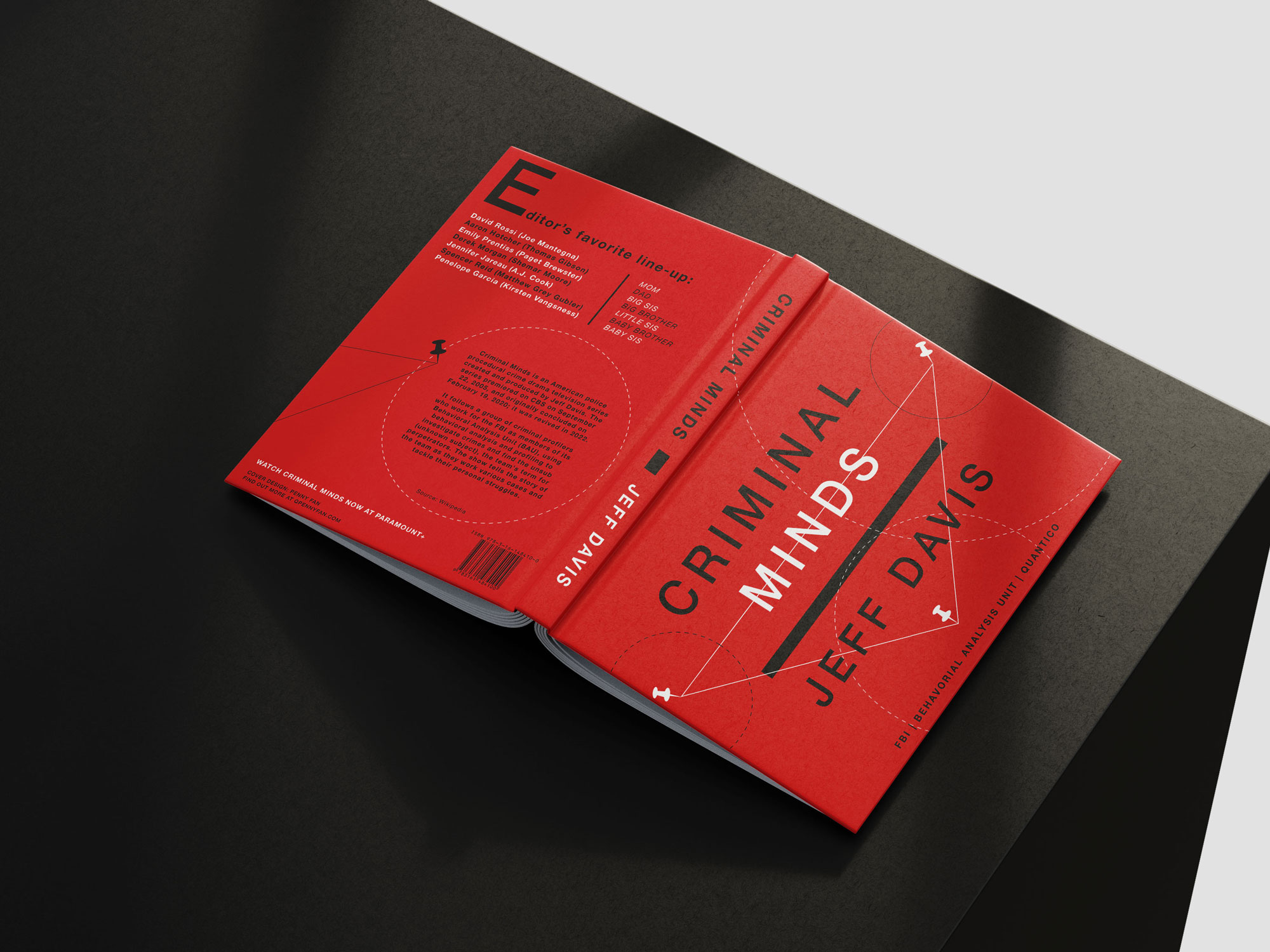
I first tried the signature rectangles, then moved on to other more dynamic shapes like triangles and circles. That's when I thought of Geographic Profiling, where Dr. Spencer Reid (my favorite character) would always use pins to mark out the different crime locations, then narrow down where the offender might live or work.
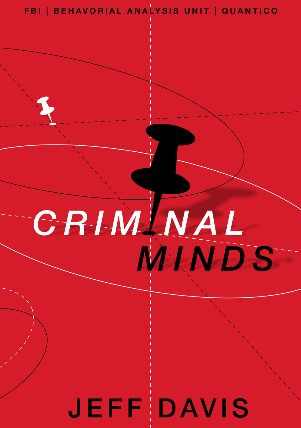
The big pin that replaces the letter "i" in the word "criminal" symbolizes that the criminal would eventually be pin-pointed out on the map and caught.
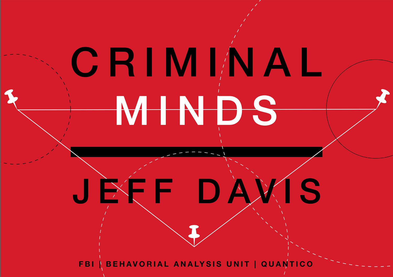
This design shows the minimal three pinned locations needed for triangulation in geographic profiling, with a connecting line that cross the word "minds", a wordplay: the criminal's location has already "crossed the BAU teams' minds".
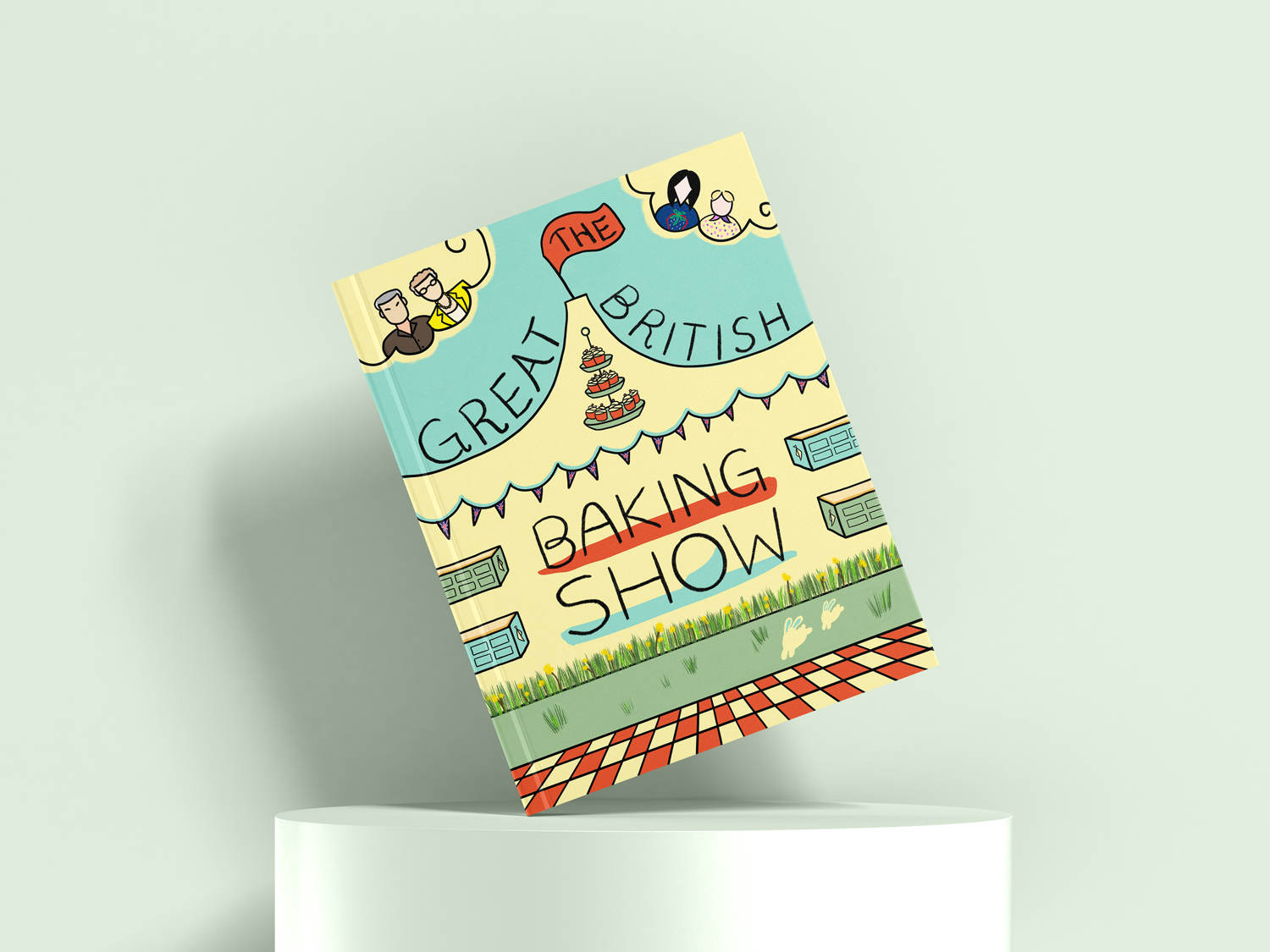
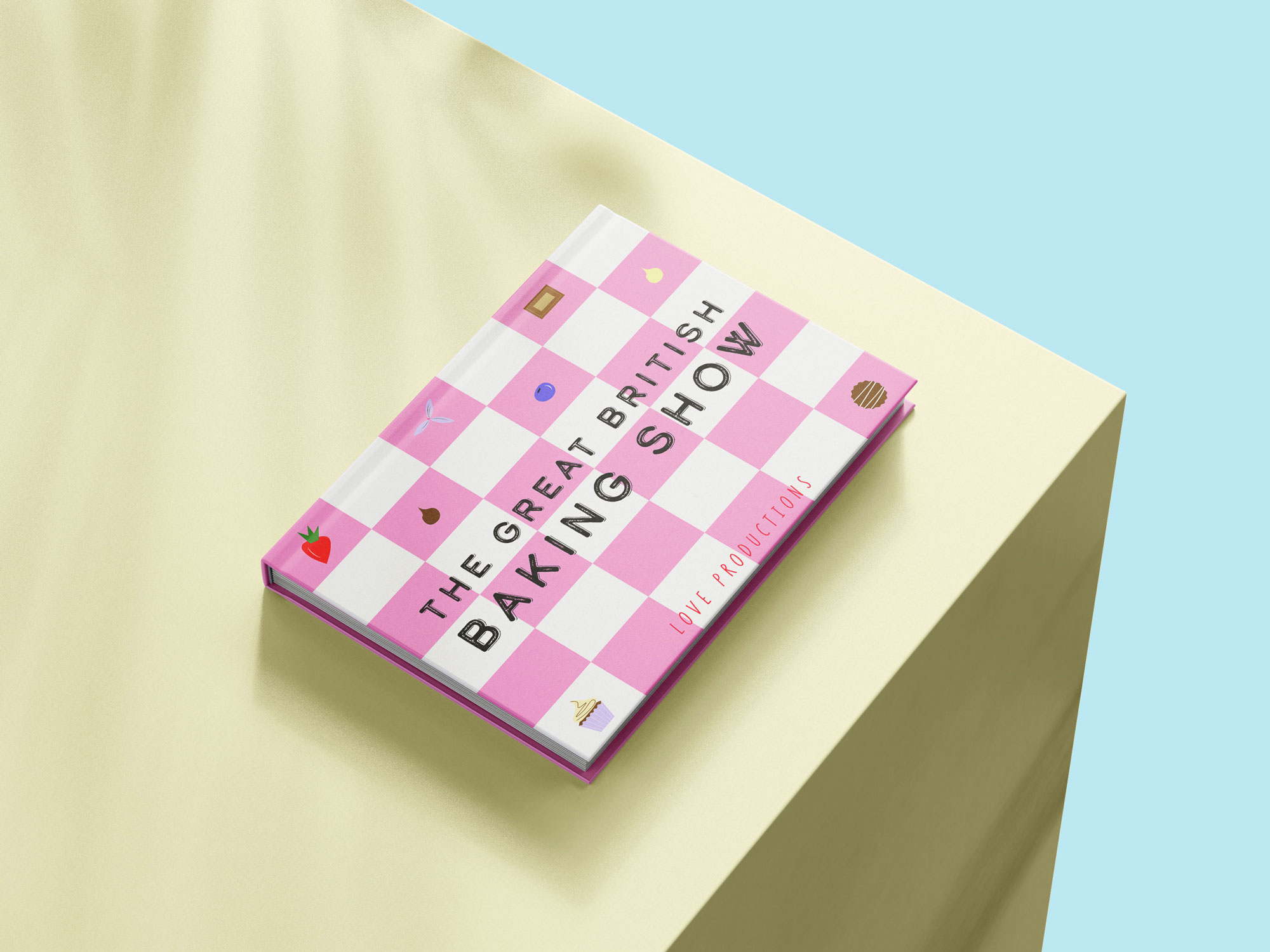
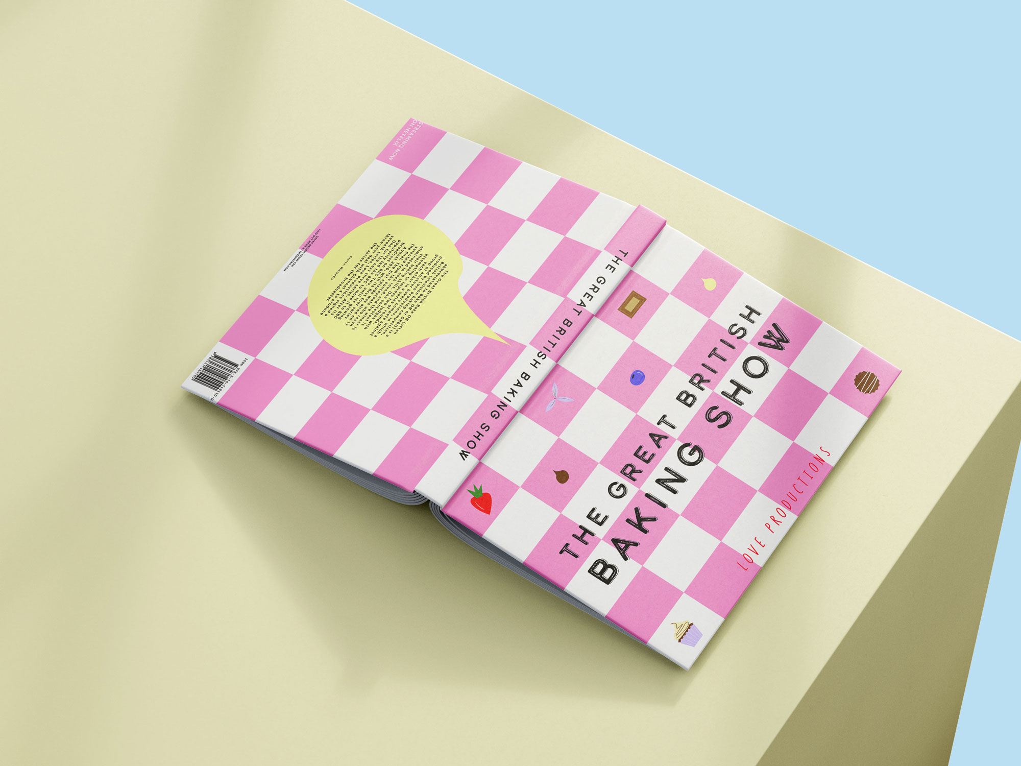
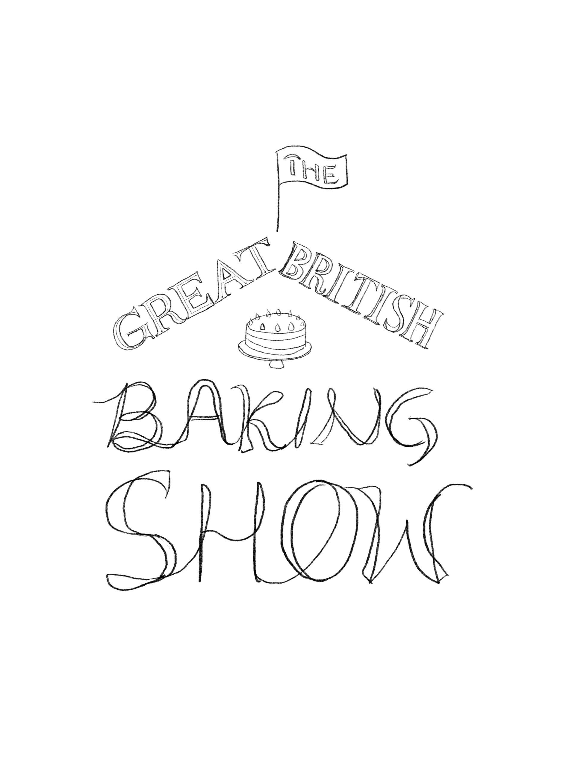
The Great British Baking Show
Selected Works

39° SensitivoDesign for People | A Self-Care App
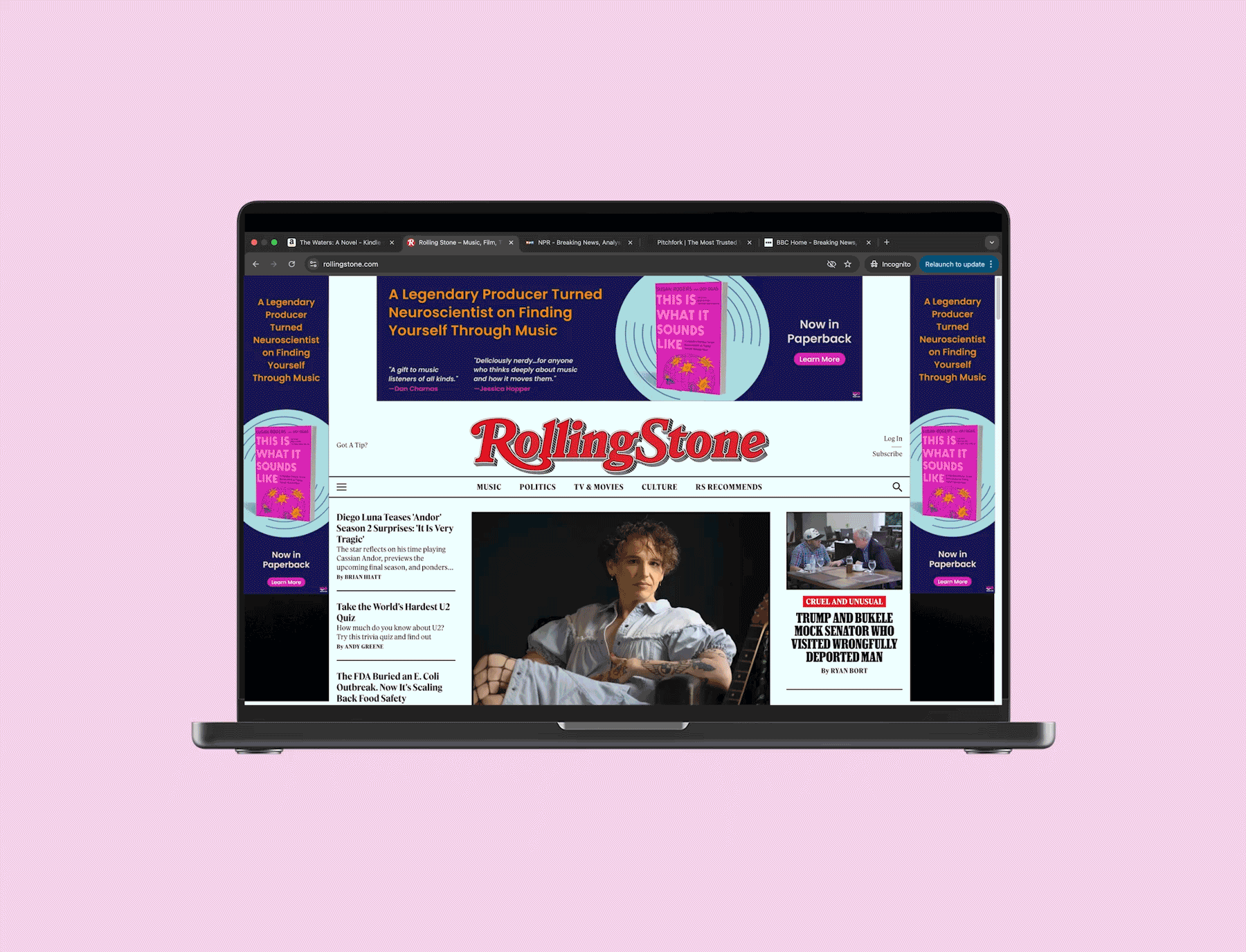
W. W. Norton & CompanyDesign in Book Publishing

Café le soirReimagining Urban Space | Branding
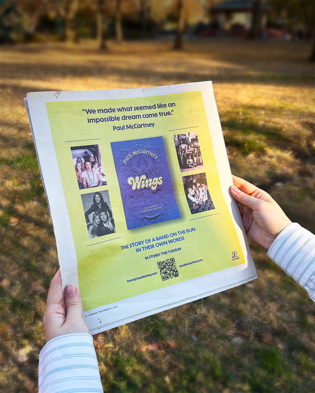
NY Times Printed AdPrint Design
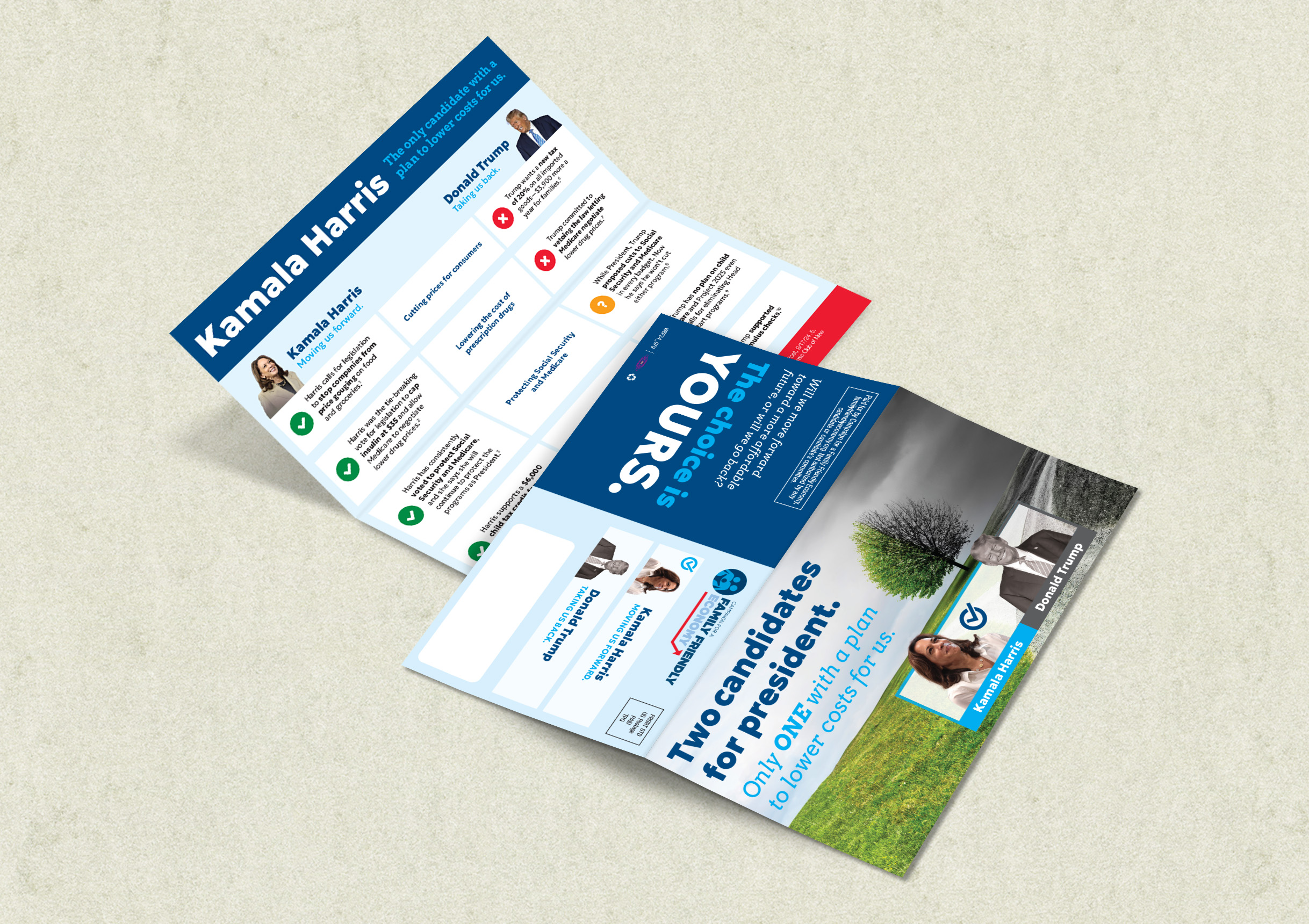
The Pivot GroupDesign for Democracy
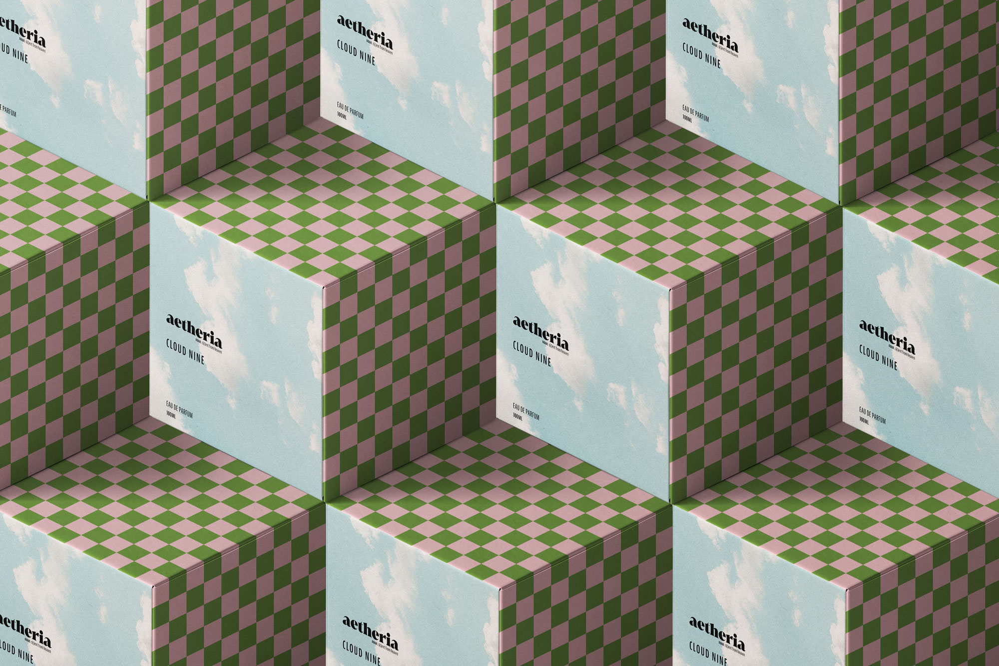
aetheriaFeel-Good Perfume Brand
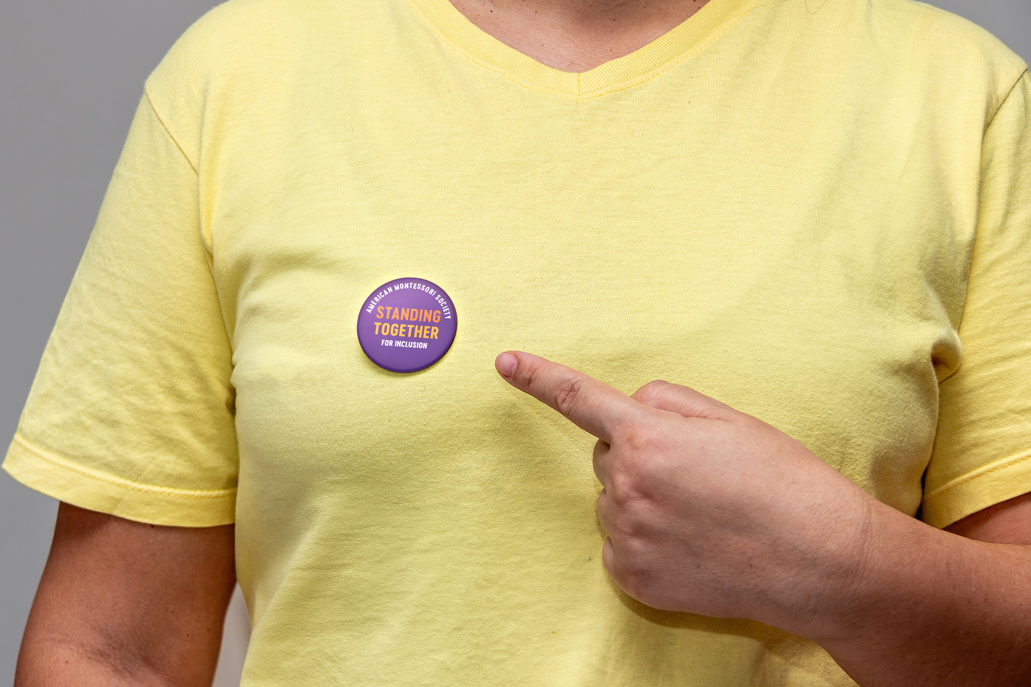
American Montessori SocietyDesign in Non-Profit & Education
Turning my Favorite Shows into Book CoversFor Funsies

Business Outreach Center Network (BOCNET)Design for Underserved Communities
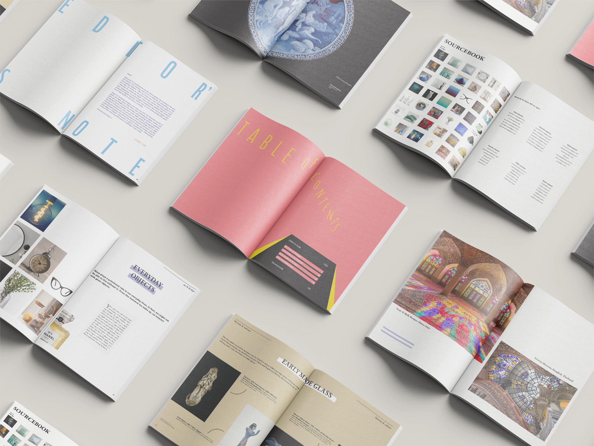
Glass, A Little Bit of EverythingA Book for Museum Gift Shop
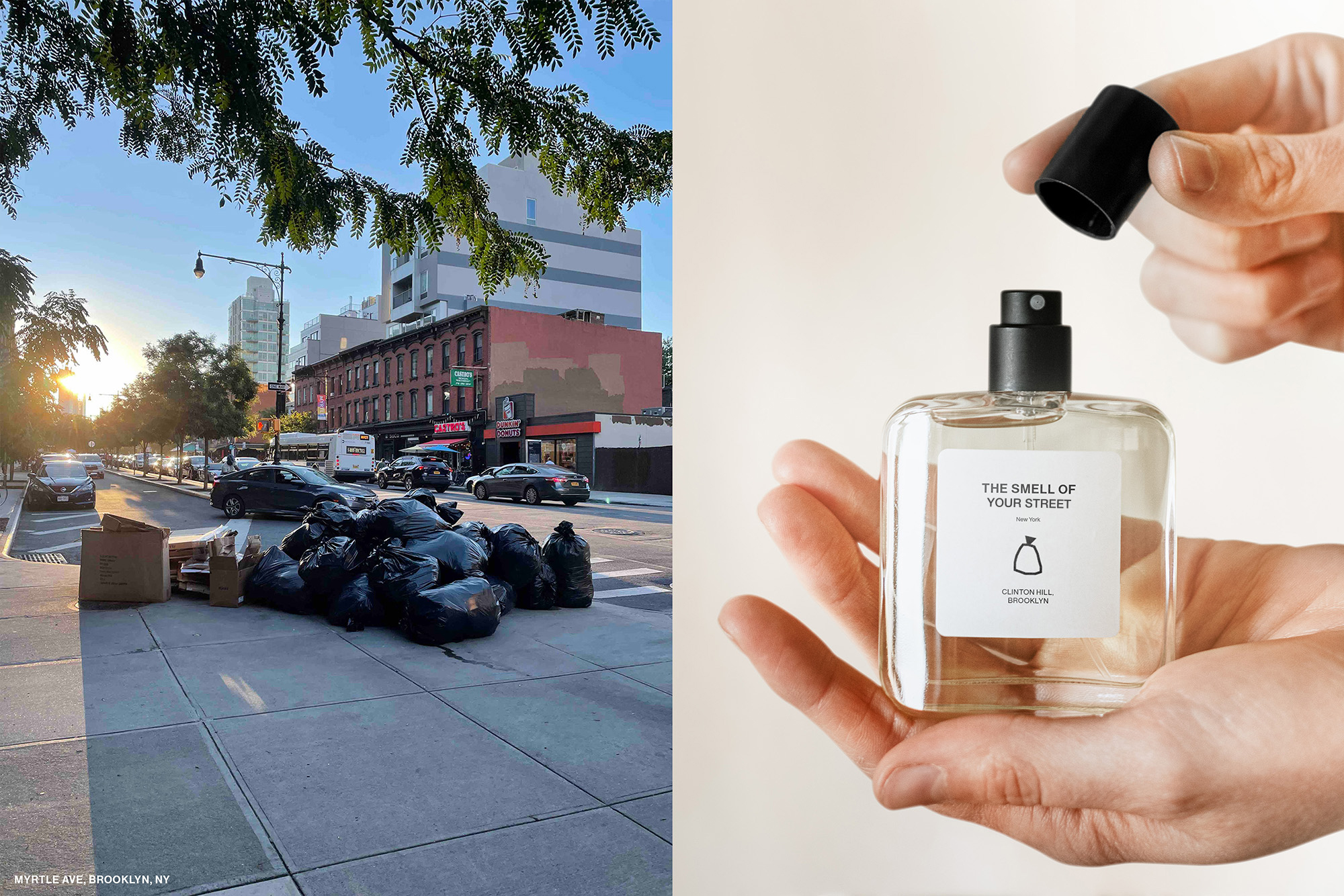
(In)visible WasteA Case Study on the Issue of Waste/Trash